Did you see the white round, shapeless robot that is cleaning, teaching or just thinking? Or the holographic supernova of a brain and head mixed in the supersonic blueness? I was wondering why all AI visualizations were so similar, this is my discovery of the topic.
![[[Fájl:Artificial Intelligence & AI & Machine Learning - 30212411048.jpg|thumb|A mesterséges intelligencia a gépi tanulás, az adatfeldolgozás és az automatizált döntéstámogatás egyik központi fogalma.]]](https://hatvanipeter.hu/wp-content/uploads/2026/08/1920px-Artificial_Intelligence_26_AI_26_Machine_Learning_-_30212411048.jpg)
This image is the main visual for the wikipedia page of Artificial Intelligence. As you can see it is not saturated, it has no distinct shape or features. It is an average of human bodies, but in pure white. I chose this image, because it is a great example, you can find a whole lot more like it. I will get back to the why, but first observe this image generated by Gemini.
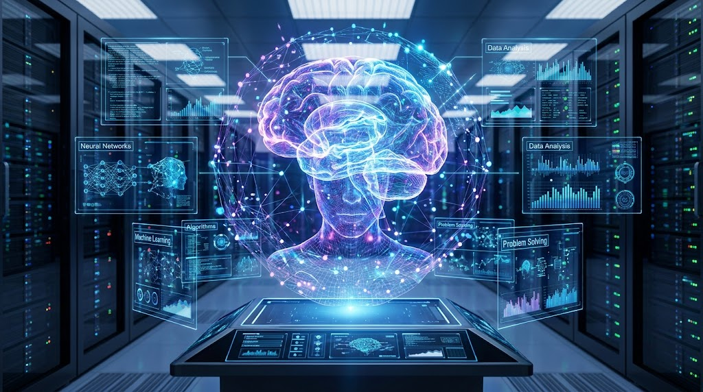
Behold! AI archetype version 2. The blue blob of holographic glory, the quintessential INTELLIGENCE. The brain, the datacenter, the globe and the graphs all pulsing together to create the artificialliest of intelligences. This image is a great example, the other half of visualized AI will be a similar hologram, just look at any advertisements on your timeline.
So why are the two archetypes with us? The first one is the washing machine of AIs. It is shapeless, efficient and tries hard not to offend. It is a product by heart and designed to be human-like. In the last decades robots were metal or black if they were hostile and no good counter examples came to life. Think about Chopping Mall or the The Terminator, big and bare creatures turning against their makers, some would argue it is the continuation of zombie culture.
But when you try to sell something, it has to be like us, but not too much. Tech creators often fall into the trap of the Uncanny Valley (funny how a human lookalike is used as a main example). On the contrary washing machines never wanted to be human-like, they are a great appliance, smooth and same. I would argue that this type 1 of AI interpretations carries the same thought, it was created to be advertised.
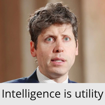
AI as an appliance, or utility is widely used today by the biggest AI lab C-levels. Sometimes they like to assume that the I in AI is a general purpose solver.
Type 2 is more cryptic. It knows it should not anthropomorphize AI, it tries to bring the symbols only. We have blue, the colour of trust, calmness. Think intel, Michelin and visa. And with the colour we have good old coats of arms. After this paragraph is Maria Theresia’s coat of arms in its full glory.

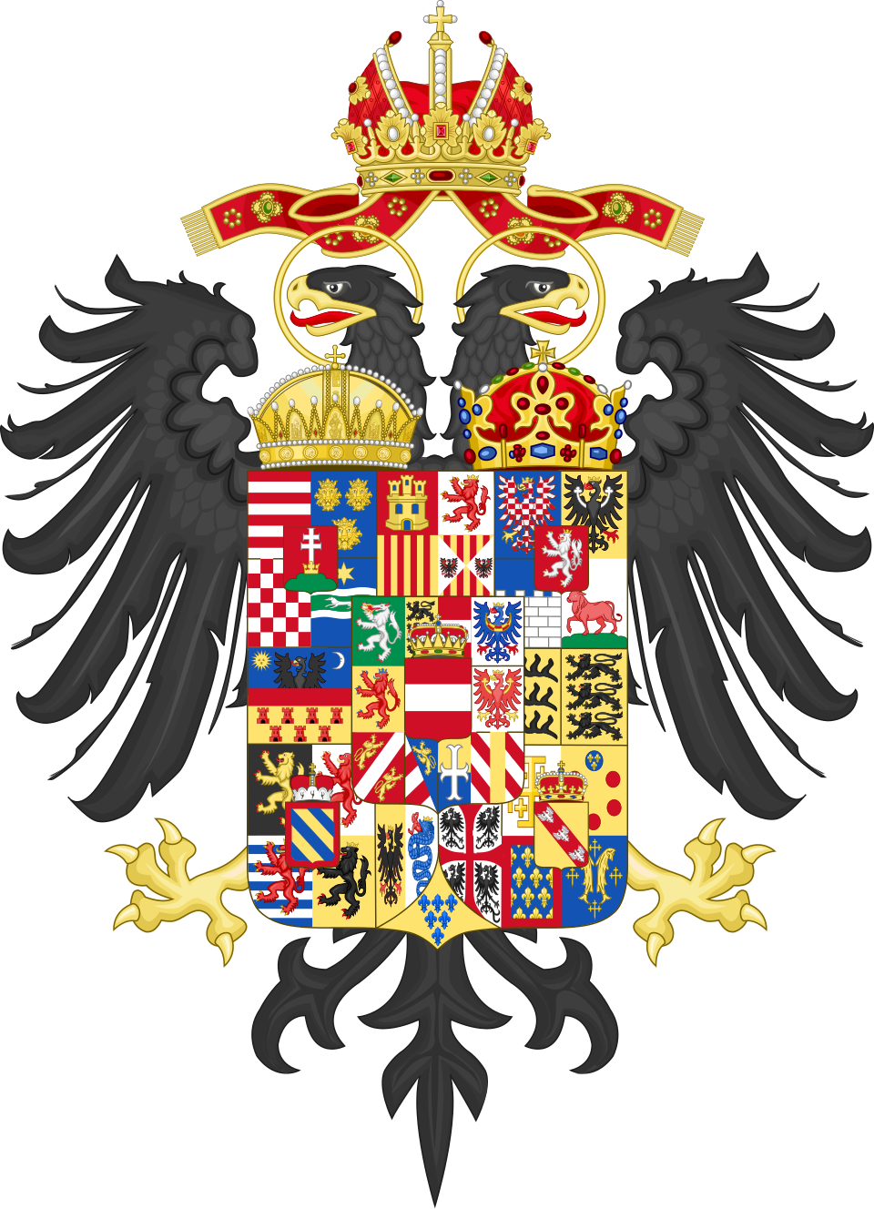
Instead of power the type 2 AI visualization shows competence. It can do it all, show, compute, know and respond. It is a superorgan, trustworthy and loyal. It it the ultimate tool, holder of knowledge and competence with the highest level of trust. It is nothing like a human, it is more, it can just appear in the middle of a data center, or in a classroom.
It is again an ad, as we can observe all AI visualizations are just advertisements to the level of culture. We got used to being sold superhuman knowledge and uderstanding, so when we search for AI we get the same results when we search for a washing machine, we get adverts.